Heavy Metal Fonts — The Typography Behind the World's Most Extreme Logos
No music genre takes typography more seriously than heavy metal. The logos of bands like Metallica, Iron Maiden, and Slayer aren't afterthoughts — they're core to the genre's identity, designed with the same intentionality as the music, and understood as distinct visual languages by informed listeners. A trained eye can identify a band's subgenre from logo style alone, before reading a single word.
This is the history and logic of that visual language — from Black Sabbath's 1970 debut through the intentionally unreadable logos of extreme metal, and into the streaming era where font choices have to work on a phone screen.
Where It Started: The 1970s Template
Heavy metal typography emerged as a distinct visual language in the early 1970s, shaped by a handful of designers working in British record labels and independent studios.
Black Sabbath's first four albums (1970–1975) were designed by Keith Stuart MacMillan, who worked under the pseudonym "Marcus Keef" for Vertigo Records in London. The self-titled debut used bold, heavy lettering in white on black — massive, embossed, with a gothic sensibility that would define the genre's visual register for decades. The 1971 Paranoid logo used a wavy, two-tier composition in extra-bold geometric sans-serif similar to Letraset's "Manuscript Capitals" — the kind of letterpress-era type that was still in wide use in British design studios of the period.
What MacMillan established with Sabbath became the template: dark backgrounds, heavy white letterforms, gothic associations, and an overall visual weight that matched the sound.
As the music became faster and more aggressive through the late 1970s and 1980s, so did the typography. Each emerging subgenre developed its own visual conventions — and those conventions are as codified and internally consistent as the music itself.
The Iconic Logos: Who Made Them and Why They Work
Metallica
James Hetfield — the band's vocalist and guitarist — designed the Metallica logo himself during high school, drawing on formal art training. He didn't hire a graphic designer. The result is one of the most recognizable logos in popular music: minimalist, geometric, with straight clean lines and sharp lightning bolt extensions on the letter legs. The extended legs of the 'M' and 'A' convey motion and aggression without decorative ornamentation.
The logo debuted on Kill 'Em All (1983) and remained consistent through Master of Puppets, Ride the Lightning, and the "Black Album," appearing in 3D versions on several covers. In 2008, London and San Francisco–based design agency Turner Duckworth modernized the logo for Death Magnetic — maintaining the aggressive aesthetic and the minimalist geometry while updating it for contemporary applications.
Hetfield's instinct — clean geometry, no ornamentation, pure aggressive shape — proved more durable than the ornate logo styles of many contemporaries.
Iron Maiden
Dennis Wilcocks, the band's original vocalist, worked with designer Ray Hollingsworth at Crowes Art Studio on Rathbone Place in London to create the Iron Maiden logo around September 1977. The font — known as Metal Lord — uses uppercase geometric letters with authoritative appearance, sharp angular lines, and distinctively elongated, diagonally-cut letter tails.
The color scheme (red, white, and black) was chosen to harmonize with the band's energy. The logo's authority comes from its combination of geometric precision and the elongated cuts that give the letterforms an aggressive, mechanical quality. It has remained essentially unchanged for nearly five decades.
Motörhead
The Motörhead wordmark uses Old English-inspired lettering with bold gothic lines — the closest matching font is Fette Unz Fraktur, designed by Peter Wiegel. But the logo is inseparable from the mascot: Snaggletooth.
Joe Petagno — an American artist who had relocated to Britain and joined the design collective Hipgnosis in the early 1970s, working alongside designers who created iconic covers for Led Zeppelin and Pink Floyd — created Snaggletooth in 1977. The mascot is a hybrid gorilla-dog-wolf skull with three-dimensional boars' teeth, chains, and spikes. Petagno studied actual skulls of wild boars, gorillas, and dogs to develop it, rendering the final version in India ink and gouache with pen, paintbrushes, and airbrush on illustration board.
The two dots above the second 'O' in Motörhead deserve their own note. Lemmy Kilmister admitted he "pinched" the umlaut idea from Blue Öyster Cult, which had used it gratuitously in their name since 1971 (credit disputed between guitarist Allen Lanier and rock critic Richard Metzler, who claimed he suggested it "because of the Wagnerian aspect of metal"). Lemmy's explanation for adding it to Motörhead: "I only put it there to look mean."
The heavy metal umlaut — umlauts used decoratively in band names with no intention of affecting pronunciation — became a genre-wide convention precisely because of this. It functions as a visual signal: foreign, gothic, extreme. It performs meaning without linguistic function.
Slayer
Slayer's logo origin is contested. Blake Edwards, a friend of guitarist Kerry King, is credited with creating the base design in 1981. Other sources attribute the final version to Steven Craig Larned for the 1983 Show No Mercy album. An alternative account places the design's genesis in Tom Araya's living room, where Dave scrawled the band's name "as if the pencil had suddenly turned into a knife" — the jagged notches becoming the defining characteristic.
The result uses rune-like straight strokes, rendered in white and bloody red, surrounded by a bronze pentagram ring with four swords. A similar font called Slaytanic was later developed by designer Chris Hansen based on the original design. The deliberate violence of the letterforms — the notched edges, the upward slash — is the design point. Nothing about the logo is accidental.
Pantera
Pantera's logo uses a font similar to Shredded (designed by TracerTong): big, bold, all-caps letterforms with scratches across the lettering that appear hand-painted under urgency. The geometric, angular approach made the logo readable at distance while the distressed texture gave it tactile aggression.
The 1990 Cowboys From Hell album established the classic blocky look. For the 2022 reunion tour, the logo was updated with more uneven edges and small holes creating wear-and-destruction effects — darker and more fractured, signaling continuity while acknowledging the band's absence and return.
The Logic of Illegibility
The most important thing to understand about extreme metal typography is this: illegible logos are illegible by design. This is not poor craftsmanship. It's intentional cultural gatekeeping.
The key figure is Christophe Szpajdel — Belgian-born calligrapher, nicknamed "the Lord of the Logos" by the metal underground (the designation emerged organically around 2006). Since designing his first professional band logo for Morbid Death in 1988, Szpajdel estimates he's created over 10,000 logos, primarily for black metal, death metal, and dark ambient bands. His notable works include Emperor (1992) and Disgrace (1990). He coined the term "depressiv'moderne" to describe his approach, citing Art Deco, Art Nouveau, and modernism as influences — though the output is nothing like those sources in surface appearance. His books "Lord of the Logos: Designing the Metal Underground" (2010) and "Archaic Modernism: The Art of Christophe Szpajdel" (2020) document the tradition.
What Szpajdel and his contemporaries understood: in extreme metal, a logo doesn't need to be read by outsiders. It needs to be recognized by insiders. An initiate sees a Szpajdel logo and immediately understands: black metal, European, underground, serious. The illegibility isn't the problem — it's the signal.
The mechanism works as a cultural filter. Complex, tangled logos require decoding. If you can read it fluently, you belong. If you can't, the logo has successfully communicated that this isn't for you — which is precisely the intended message for certain subgenre communities.
Subgenre Typography: A Field Guide
Each metal subgenre developed a specific visual vocabulary as recognizable as its sonic characteristics.
Classic Heavy Metal (1970s–1980s)
Bold, embossed serif typography. Blackletter and Old English-inspired lettering. Thick strokes with moderate readability. Dark backgrounds, high contrast. MacMillan's Black Sabbath work is the template — gothic sensibility, massive letterforms, readable at album-cover distance. Motörhead's Fraktur-adjacent wordmark fits this tradition.
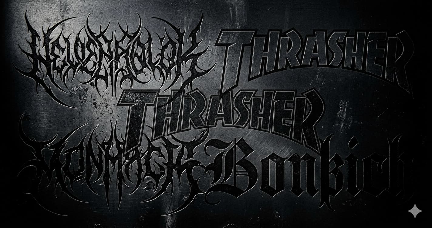
Thrash Metal
Angular, aggressive, readable letterforms. Sharp angles, jagged edges, splatter effects. Readability is maintained — thrash metal logos communicate their names as well as their aggression. The chaotic energy exists in texture and treatment, not in letterform illegibility. Metallica's geometric minimalism and Slayer's notched letterforms both fit this tradition.
Death Metal
The aesthetic of rotting, organic illegibility. Distorted, spiky, stretched letterforms using textures of flesh, entrails, and biological material. The typography is intentionally impossible to read for uninitiated viewers. U.S. and Brazilian death metal scenes developed organic, flowing distortion; Scandinavian scenes leaned toward more angular corruption.
The design logic: if a logo looks brutal and difficult to decode, it signals that the music is brutal and extreme. Illegibility is a quality marker within the subculture — readable death metal logos risk appearing commercial or soft.
Black Metal
Hand-drawn, spiky, web-like letterforms. Extended, thorny serifs. Letters interweave, overlap, and merge into compositions that resemble sigils or runes more than standard type. The aesthetic traces to early 1990s Norwegian bands — Darkthrone, Mayhem, Burzum — who pioneered raw, hand-drawn visual identities that spread as cultural badges across the scene.
Bathory's 9th album Blood on Ice used glyphs explicitly inspired by Viking runes used to record important events. Amon Amarth's lettering uses Uncial/Celtic/Gaelic-inspired forms — the closest commercial font match is Omnia (designed by Karlgeorg Hoefer), modified with added lines and rune-adapted letterforms.
The black metal visual code is now so established that a trained eye can identify a band's scene affiliation from the logo alone — geography, era, and attitude all communicated without reading the actual letters.
Power Metal and Viking/Folk Metal
Fantasy medieval letterforms. Ornate, regal, elaborate designs inspired by European medieval calligraphy and Gothic manuscripts. The aesthetic draws on Tolkien, Norse mythology, and historical fantasy. Readable — power metal wants its name known — but wrapped in the visual language of epic narrative. Fonts like Black Sting and Silvermoon exist specifically for this aesthetic.
Doom Metal
Heavy, crushed, condensed letterforms. Irregular baselines. Uneven stroke weights — intentionally. The typography conveys weight and violence through letterform alone, without biological texture (that's death metal) or thorny illegibility (that's black metal). The visual equivalent of tuned-down, slowed-down heaviness.
Blackletter in Metal: The Historical Thread
The connection between blackletter typography and heavy metal runs deep and through multiple channels.
Blackletter — Fraktur, Textura, Old English — has been borrowed by metal bands across all subgenres as diverse as Black Sabbath and Behemoth. The reasons are consistent:
Visual weight. Blackletter's thick strokes convey heaviness and darkness. This aligns directly with metal's sonic register.
Historical resonance. Blackletter was the script of medieval Europe — the letterform of cathedrals, religious manuscripts, and the printing press. Metal's preoccupation with medieval themes, occultism, and pre-modern history maps naturally onto the letterform of that era.
Cultural authority. A metal band using gothic Fraktur looks established and credible within the genre. The aesthetic association is so strong that gothic type functions as a genre signal independent of the band name.
The Nazi paradox. Gothic letterforms carry a complicated 20th-century history. The Nazi party initially promoted Fraktur as the "German script" — then abruptly abandoned it in 1941 via a Bormann circular that reclassified Fraktur as "Judenlettern" (Jewish letters), ordering a switch to Roman type for practical wartime communication. The script that seemed most "Germanic" was deemed foreign by the regime that most claimed Germanness. Metal's use of gothic lettering connects to medieval Europe, not to 20th-century nationalist politics — but the history is worth knowing.
For the complete history of gothic letterforms from 12th-century manuscripts through the digital era, see the Gothic Font History guide. For blackletter's connections to tattoo culture, see Gothic Fonts for Tattoos.
The Streaming Era: Typography Under Pressure
The rise of digital streaming and social media created a new set of constraints that metal typography had never faced.
A death metal logo designed to be illegible as 12-inch album art doesn't work as a 200×200-pixel Spotify profile image. The layered, thorny complexity that communicates authenticity at poster scale becomes an unreadable smear at thumbnail size.
The practical response: many bands now maintain two visual identities simultaneously.
- The ornate primary logo — used for album art, merchandise, concert visuals, and community contexts where authenticity is paramount
- A readable wordmark — used for streaming platforms, press kits, social media headers, and contexts where algorithmic legibility matters
This dual-system approach lets bands inhabit both spaces — maintaining credibility within the metal underground while being discoverable by new listeners on streaming platforms.
The tension isn't resolved; it's managed. Some bands resist the readable wordmark entirely, accepting reduced streaming visibility as the price of aesthetic integrity. Others fully adapt. Most occupy the middle ground.
Generate Gothic and Metal-Style Text
For personal use — band merch, project names, social profiles, aesthetic lettering — the Lettertype Gothic Generator and Old English Generator render blackletter and gothic-style Unicode text in seconds. Copy and paste into any platform that supports Unicode text.
For historical context on blackletter's origins and the Nazi paradox, the Gothic Font History guide covers the full arc from 12th-century manuscripts to contemporary digital type.
Frequently Asked Questions
What font does Metallica use?
Metallica's logo was hand-designed by vocalist James Hetfield himself during high school, not based on an existing commercial font. The geometric, angular letterforms with lightning bolt leg extensions were Hetfield's original creation. The logo was modernized in 2008 by design agency Turner Duckworth for the Death Magnetic album.
What font does Iron Maiden use?
Iron Maiden's logo uses a typeface known as Metal Lord — uppercase geometric letters with sharp angular lines and distinctive elongated, diagonally-cut letter tails. The logo was created by Ray Hollingsworth at Crowes Art Studio around September 1977, in collaboration with the band.
What font does Motörhead use?
The Motörhead wordmark is closest to Fette Unz Fraktur, a blackletter font designed by Peter Wiegel. The logo uses Old English-inspired gothic lettering with bold strokes — the font that matches the style most closely for digital applications.
Why are death metal logos unreadable?
Intentionally. Death metal logos use illegibility as a cultural filter and authenticity signal. A complex, unreadable logo communicates extremity and underground credibility — it's designed for genre insiders who can read the visual language, not for mainstream audiences. Christophe Szpajdel, the designer credited with creating over 10,000 metal logos, describes the aesthetic as communicating "affiliation and intent" to an initiated audience rather than being read literally.
What is the heavy metal umlaut?
Umlauts (ö, ä, ü) used decoratively in heavy metal band names with no intent to affect pronunciation — most famously Motörhead and Blue Öyster Cult. Lemmy Kilmister explained his use: "I only put it there to look mean." The convention spread from Blue Öyster Cult (1971) through the genre as a visual marker of gothic, foreign, extreme aesthetics. It functions as a signal rather than a linguistic element.
What fonts are used in black metal logos?
Black metal logos are predominantly hand-drawn rather than based on commercial fonts — the hand-crafted quality is central to the aesthetic. Where commercial fonts are referenced, heavily modified gothic, runic, and blackletter styles are the basis. Amon Amarth uses Uncial-inspired lettering closest to the commercial font Omnia (designed by Karlgeorg Hoefer), significantly modified with rune-adapted letterforms.