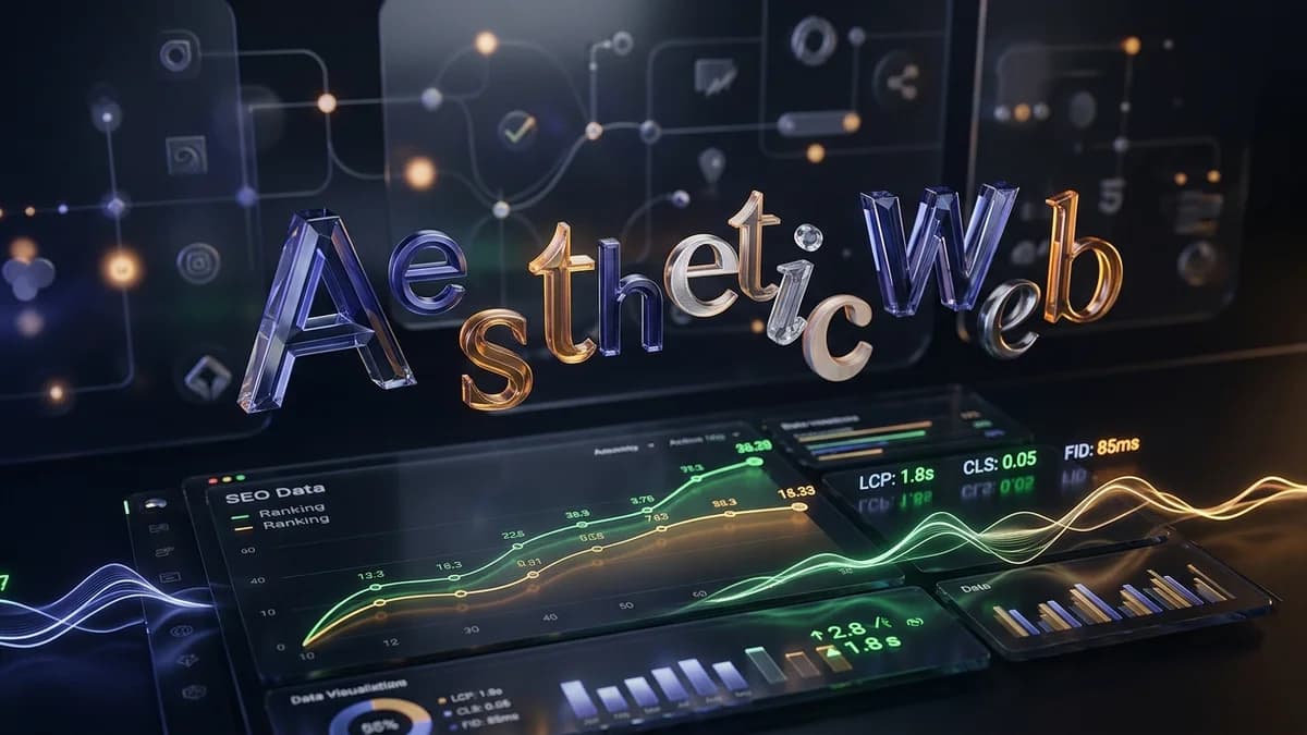
How Web Typography and Brand Aesthetics Impact Search Engine Optimization
When a user visits a website, neuromarketing research indicates they form an initial aesthetic judgment in just 17 to 50 milliseconds. Long before they read a single word of your copy, their brain has already processed the visual hierarchy, the layout, and most importantly, the typography. Fonts are the silent ambassadors of your brand. They shape the tone, influence perception, and create an atmosphere that users either trust or reject instantly. However, there is a hidden tension in digital design. The visually stunning, custom typography that builds an unforgettable brand identity can sometimes be the very thing that ruins a website's technical performance. Striking the right balance between aesthetic appeal and technical efficiency is crucial for modern digital success, especially as mobile browsing becomes the global standard.
The Visual Power of Digital Typography
A well-chosen font does more than just display text. It communicates brand values, establishes trust, and guides user behaviour across different platforms. In fact, research shows that approximately 46.2 percent of users assess the baseline credibility of a website based strictly on visual design elements, with typography playing a leading role in that assessment. Eye-tracking studies further confirm that users rarely read web pages line by line. Instead, they scan in F-patterns, where typography hierarchy, weight, and text scaling instantly dictate their level of engagement and comprehension.
If you are building a digital identity from scratch or presenting your work to stakeholders, clean typography is absolutely non-negotiable. For instance, when looking at strategies on how to present mobile app design to clients, maintaining consistent font choices and a solid text hierarchy is essential for making a prototype feel polished and cohesive. When a brand's visual presentation is seamless across desktop and mobile environments, users are far less likely to abandon the site due to design friction or cognitive overload.
How Font Choices Affect Search Visibility
While beautiful typography captivates human eyes, algorithms view websites through a much more technical, performance-driven lens. Heavy, unoptimised custom web fonts can significantly slow down page loading speeds. This creates a challenging scenario where the very design elements meant to attract users actively prevent them from ever seeing the page. As mobile users increasingly demand instant access to information, these delays become catastrophic for user retention.
This technical backend is an absolutely fundamental pillar of search engine optimization. Search engines heavily prioritise user experience, which is increasingly measured through strict performance metrics like Core Web Vitals. For example, the official threshold for a passing Largest Contentful Paint (LCP) score is 2.5 seconds or less. If your custom font files are massive, they will delay the rendering of the largest text blocks on the screen. Furthermore, in March 2024, major search engines officially replaced First Input Delay (FID) with Interaction to Next Paint (INP) to measure page responsiveness. A site must visually respond to user interactions in under 200 milliseconds to achieve a good rating. Bulky typography files can tie up browser resources, directly harming these vital metrics and ultimately reducing organic search traffic.
Balancing Aesthetics and Accessibility
Visual identity goes well beyond file sizes and raw loading times. It also includes how legible your brand remains under various conditions and for differently abled users. According to recent accessibility reports, low-contrast text remains the number one accessibility issue on the internet, causing a vast majority of analysed homepages to fail basic compliance. A brand cannot truly be successful if its typography excludes a significant portion of its audience.
The updated Web Content Accessibility Guidelines (WCAG) mandate strict rules for digital typography. Adhering to these standards ensures your brand message reaches everyone efficiently and without visual strain. Consider these core principles for accessible digital typography:
- Contrast Ratios: Maintain a minimum contrast ratio of 4.5:1 for normal text and 3:1 for large text to achieve AA-level compliance.
- Fluid Sizing: Ensure that text can be resized up to 200 percent without breaking the page layout or hiding essential content.
- Font Legibility: Choose typefaces with distinct character shapes to prevent confusion between similar letters, particularly on smaller mobile screens.
- Line Spacing: Provide adequate line height (usually 1.5 times the font size) to help readers track text comfortably across wide columns.
Best Practices for Technical Font Optimisation
To prevent beautiful branding from harming site performance, designers and developers must work closely to optimise how fonts are loaded. When web fonts swap in late, they often cause a Flash of Unstyled Text (FOUT) or a Flash of Invisible Text (FOIT). This actively degrades a site's Cumulative Layout Shift (CLS) score, signalling visual instability to algorithms and frustrating users who lose their place on the page.
Fortunately, there are proven strategies to mitigate these technical hurdles. Technical documentation provides clear best practices for fonts that detail how developers can prevent browsers from delaying text rendering. By inlining critical font declarations, preconnecting to third-party origins, and strategically using the font-display: swap attribute, you can ensure that typography enhances the design without harming your overall technical performance.
The business impact of making these adjustments is highly documented across the tech sector. Case studies show that optimising these technical metrics has a direct, measurable financial benefit. For instance, performance improvements on major web portals, particularly regarding layout shifts caused by fonts, have boosted average user session time and overall conversion rates significantly. Global brands have also discovered a strong negative correlation between high Largest Contentful Paint times and bounce rates, leading them to entirely restructure their frontend approach to prioritise lightweight, system-safe font fallbacks.
Final Thoughts on Web Typography
The intersection of branding, web tools, and technical performance is where true digital success lies. Web typography should never be an afterthought, nor should it become a bottleneck that limits your online reach. By carefully selecting accessible, visually compelling fonts and employing modern loading techniques, brands can craft stunning digital experiences that perform exceptionally well. Ultimately, a rigorously optimised typographic system ensures your website captures attention instantly, retains user interest, and satisfies the strict technical demands of modern search algorithms.