How to Present a Mobile App Design So Clients Actually Get It
Presenting a mobile app design to a client often feels harder than making the design itself. You spend days working on layouts, button states, and font choices in Figma. Then you show static artboards during a call, and the client just looks confused or asks why the design feels flat.
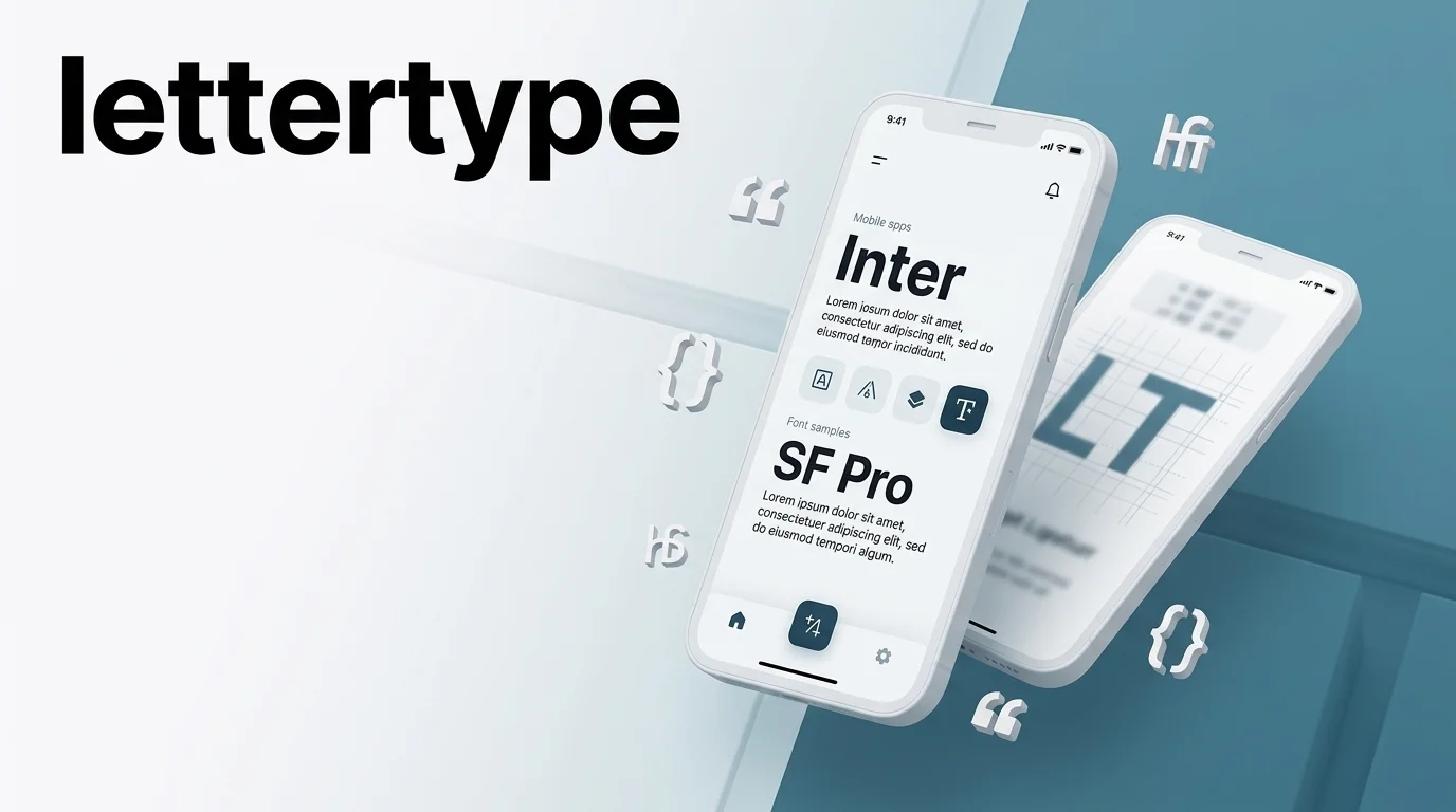
The issue is rarely your work. Most clients do not use design tools every day, so they cannot imagine how a flat frame will look on an actual phone. Using a clean iPhone mockup helps bridge this gap by showing your layout inside a realistic device screen.
In this guide, we will look at how to show your work clearly, guide the client through your choices, and get sign-offs without endless revisions.
Why Flat Screenshots Fall Short
When you send a PDF full of flat artboards, you force the client to guess how the app feels in hand. Flat 2D screens do not show scale, depth, or screen bounds well.
Placing your work inside an authentic device frame gives immediate real-world context. The client instantly sees where navigation bars sit, how content fills the screen, and how the app fits into a physical hand.
This approach changes the conversation. Instead of treating your presentation like a collection of graphic images, the client looks at a real product concept.
Showing Screens in Context on a Real Device
Apps are used everywhere: on buses, in offices, and on couch screens at night. Showing screens in context on a real device makes your presentation more convincing than presenting isolated UI cards on a gray canvas.
Dynamic Angles over Flat Grids
Instead of laying out ten screens in a flat row, tilt key screens at subtle isometric angles. This adds a sense of depth and layer separation, which works well for complex user flows.
Selecting the Right Device Frame
Match the device frame to the project style. Use clean, minimal device renders for business tools, or lifestyle scenes for social and consumer apps.
Choosing Scenes, Angles, and Lighting
Good lighting and scene choices highlight your layout without distracting from the UI.
- Soft Directional Light: Use clean studio light with soft drop shadows to separate the phone frame from the background.
- Neutral Backgrounds: Stick to muted gray, off-white, or deep dark tones. Bright or busy backgrounds draw focus away from your screens.
- Close-Up Crops: Zoom in on small components like custom cards or menu items when you want to show fine detail.
- Figma Export Resolution: Always export your screen assets at 2x or 3x resolution (Retina quality) before placing them into device scenes. Low-resolution exports cause pixelated text rendering when clients zoom in on high-density 4K displays during presentation calls.
Keeping Typography and Color Consistent Across Screens
Because Lettertype focuses on clean typography and fonts, text hierarchy deserves special attention in your app presentations. If your font sizes, line heights, or primary accent colors shift from screen to screen, the client will feel that the UI is messy even if they cannot name the exact design flaw.
Standard Mobile Font Scaling Baseline
Maintaining a predictable typographic scale prevents body copy and headers from competing for attention across different app views:
- Hero Headers & Page Titles: 28pt – 32pt (Bold / Medium)
- Body Text & Form Inputs: 14pt – 16pt (Regular / Medium)
- Captions, Badges & Labels: 11pt – 12pt (Regular / Semibold)
Setting Up Your Text Hierarchy
- Title and Header Fonts: Keep font weights, kerning, and display sizes standard across all main view screens.
- Body Text Contrast: Check that body text stays readable on both light and dark backgrounds.
- Grid Alignment: Make sure button labels, card headers, and input fields line up cleanly on your layout grid.
Keeping your text style consistent across every slide makes the entire presentation look solid and finished.
Common Mistakes in App Presentations
Avoid these common traps when walking clients through your screens:
- Showing Every Screen in Order: Do not start with splash screens, login boxes, or password resets. Jump straight to the main feature screens first.
- Talking About Visuals Before Business Value: Explain why a layout decision helps the user before asking if the client likes the color.
- Crowding Too Many Screens on One Slide: Put no more than two or three screens on a single slide so people can read the text without zooming in.
- Ignoring Real Text Sizes: Always preview screens at true device scale to make sure labels and touch targets are actually readable.
- Skipping Dark Mode Text Contrast Variations: Many contemporary mobile apps rely on adaptive themes. Failing to showcase how your primary accent colors and font contrast translate into Dark Mode often leads to unexpected revisions later when body copy becomes unreadable against pitch-black backgrounds.
Getting Fast Presentation Approvals
Client sign-offs happen much faster when you remove the guesswork. By dropping flat screenshot dumps, placing your UI into realistic device scenes, and keeping your typography consistent, you help clients see the real value of your design work.