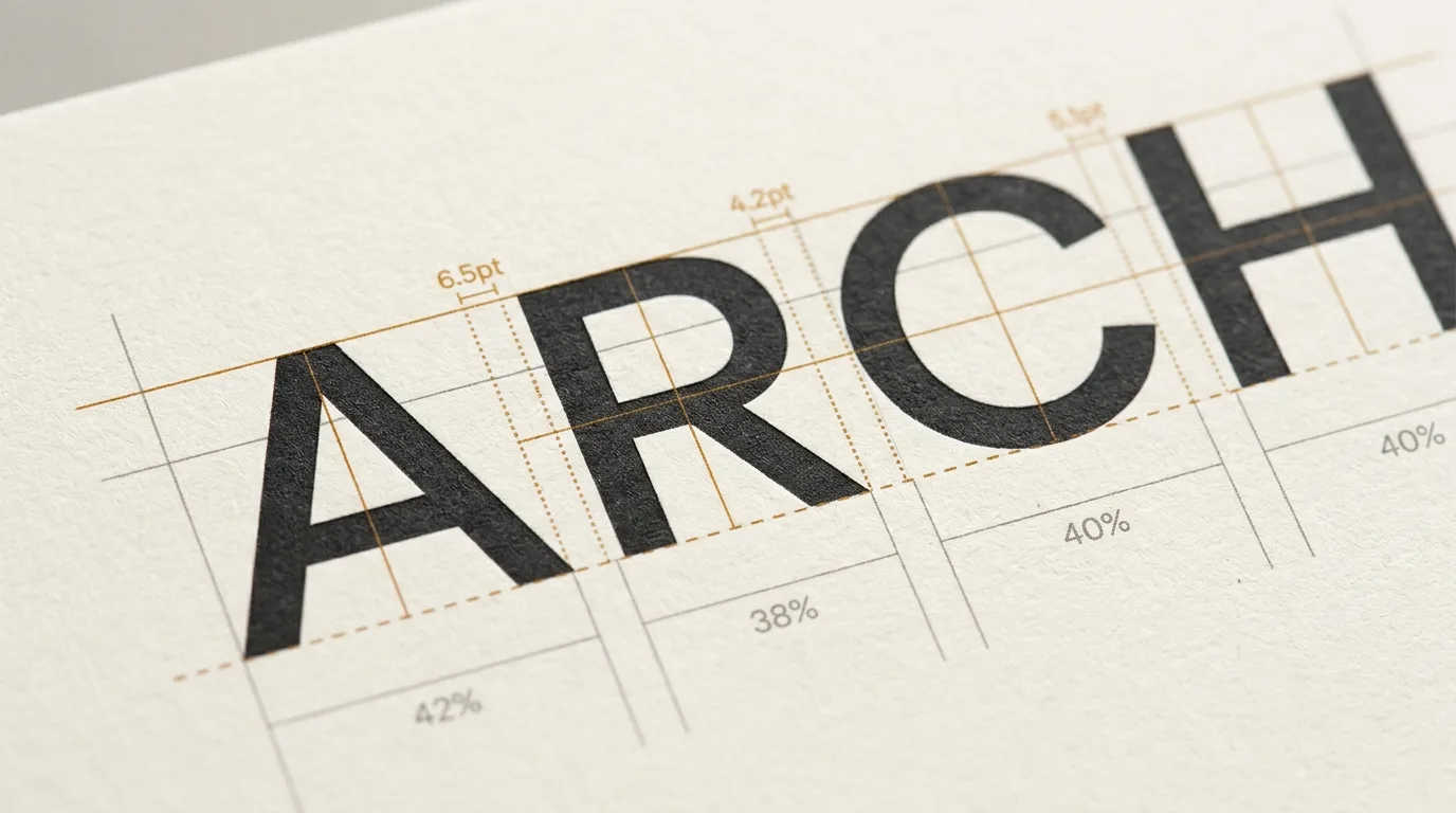
Kerning, Tracking & Leading — The Complete Typographic Spacing Guide
When people critique typography, they almost always focus on letterforms: the curvature of a serif, the geometric precision of a bowl, or the angle of a terminal. But professional typographers understand a fundamental truth that separates amateur typesetting from editorial excellence: typography is not just the study of black ink; it is the deliberate architecture of white space.
Three distinct spatial dimensions govern how text breathes, flows, and delivers meaning: kerning, tracking, and leading.
While these terms are frequently conflated by non-designers—often bundled into vague feedback like "make the letters tighter"—each operates on a completely different typographic axis. Misunderstanding their distinct roles leads to awkward line rags, unreadable body paragraphs, and compromised brand authority.
Here is the comprehensive guide to typographic spacing: what each dimension controls, the historical mechanics behind them, and practical rules for perfecting digital typesetting across web and UI design.
The Spacing Hierarchy at a Glance
Before examining each dimension in depth, consider how they interact on the page:
| Typographic Dimension | Target Axis | Scope of Influence | Primary Purpose | CSS Equivalent |
|---|---|---|---|---|
| Kerning | Horizontal | Individual letter pairs (e.g., AV, To, WA) | Eliminates uneven optical gaps between specific glyph shapes | font-kerning, OpenType kern |
| Tracking | Horizontal | Entire words, sentences, or paragraphs | Controls overall typographic density, rhythm, and tone | letter-spacing |
| Leading | Vertical | Distance between consecutive baselines | Prevents line collision and guides the eye across reading lines | line-height |
1. Kerning: The Art of Optical Balance
Kerning refers to the adjustment of horizontal space between two specific consecutive characters.
Unlike monospace fonts—where every character occupies the exact same rectangular horizontal footprint (such as our monospace font generator)—proportional typefaces give each letter an inherent width based on its geometry. An M is naturally wider than an I.
However, geometric bounding boxes cannot account for the irregular negative spaces created by diagonals, overhangs, and open apertures.
Why Kerning Pairs Exist
Consider the uppercase pair AV. If placed side by side using standard character bounding boxes:
- The right diagonal stroke of A slants upward and to the left.
- The left diagonal stroke of V slants downward and to the right.
- If left unkerned, the vast wedge of negative space between them creates an accidental visual pause, making "AV" appear disconnected from the rest of the word.
To correct this, a typographer pulls the letters closer together, tucking the top-left apex of V over the bottom-right foot of A.
Unkerned:   | A | | V |   -->   A   V   (Notice the gaping white void)
Kerned:     | A V |       -->   AV      (Balanced optical mass)
Other notorious kerning pairs that require meticulous attention include:
- T + lowercase vowels (To, Ta, Te) — The crossbar of the T creates an open shelter underneath where lowercase letters must tuck.
- W or V + punctuation (W., V, ) — The bottom taper leaves excess space before the period or comma.
- L + apostrophe or quote (L', L") — The lower arm of the L creates a wide right corner.
- Numbers with diagonal slashes (7/4, 1/2).
Metric vs. Optical Kerning
Modern digital design tools (Figma, Adobe InDesign, Illustrator) offer two primary automated kerning engines:
- Metrics Kerning (Font Built-in): Uses the predefined kerning tables authored by the typeface designer. High-quality commercial typefaces contain thousands of hand-crafted kerning pairs. This is almost always the default and preferred setting for running body copy.
- Optical Kerning (Software Calculated): Ignores the font designer's tables and uses algorithmic shape recognition to space glyphs based on their visual mass. Optical kerning is essential when:
- Combining two different typefaces in a single display lockup.
- Setting headlines in display fonts with poor or incomplete built-in kerning tables.
- Mixing standard text with decorative glyphs, small caps, or math symbols.
Pro Tip for Display Headlines: Turn your headline upside down. When you can no longer read the words semantically, your brain stops processing language and evaluates pure abstract volume. If one gap appears darker or lighter than the others, adjust the kerning manually.
2. Tracking: Controlling Textual Density and Rhythm
While kerning adjusts the relationship between two specific letters, tracking (also historically called letter-spacing) applies a uniform horizontal space across an entire range of text.
Where kerning solves geometric irregularities, tracking sets the typographic tempo.
Normal:      AUTHENTIC DESIGN CRAFT
Tracked out: A U T H E N T I C   D E S I G N   C R A F T   (+120 tracking)
Tightened:   AUTHENTIC DESIGN CRAFT                        (-20 tracking)
The Golden Rules of Tracking
Tracking is not a decorative toy; it serves strict functional and hierarchical objectives:
Rule 1: Always Add Tracking to All-Caps Headlines
When lowercase letters are set, their ascenders (h, k, d) and descenders (p, y, q) naturally create rhythmic whitespace. Uppercase letters, however, are uniform blocks of equal height. When set in sequence without extra tracking, capital letters choke each other.
- Guideline: Add between
+5%and+15%tracking (in CSS:letter-spacing: 0.05emto0.15em) to uppercase titles and navigation buttons.
Rule 2: Increase Tracking as Font Size Decreases
At 8px to 11px (captions, legal disclaimers, microcopy, badge labels), ink and pixels blur together. Counter-spaces inside e, a, and s fill in.
- Guideline: Expand tracking slightly (
+0.02emto+0.04em) on micro-copy to preserve legibility on low-resolution displays.
Rule 3: Tighten Large Display Headlines
When a font is scaled from 16px body copy to a massive 72px hero headline, the built-in spacing scales up proportionally—and often appears far too loose.
- Guideline: Apply subtle negative tracking (
-0.01emto-0.03em) on large display headlines to create a punchy, cohesive editorial lockup.
Rule 4: Never Track Out Lowercase Body Text
Expanding tracking on lowercase paragraphs disrupts the eye's ability to recognize word shapes (bouma patterns). The reader's cognitive load increases because the eye struggles to identify where words begin and end. Keep body copy tracking at 0 or default.
3. Leading: Line Spacing and Vertical Rhythm
Leading (pronounced ledd-ing) is the vertical distance measured from the baseline of one line of text to the baseline of the line directly below it.
The term originates from the era of manual metal typesetting, where letterpress operators inserted physical strips of lead between rows of type to separate lines.
---------------- Baseline 1: The quick brown fox jumps ----------------
       ^
       |  <--- Leading (Line-height)
       v
---------------- Baseline 2: over the lazy sleeping dog ---------------
Why Proper Leading Determines Readability
When a reader completes a line of text, their eye must perform a physical movement called a return sweep—traveling from the right edge back to the start of the next line on the left.
- Too Tight (Leading too small): Lines merge into gray stripes. Ascenders from line 2 collide with descenders from line 1. Readers frequently jump to the wrong line during return sweeps, causing fatigue.
- Too Loose (Leading too large): The paragraph breaks apart into isolated floating strips. The reader loses the contextual thread between sentences.
The Ideal Leading Formulas for Web and UI
Leading is fundamentally tied to two variables: font size and line length (measure).
- For Body Text (15–18px): Use a leading ratio of 140% to 160% (in CSS:
line-height: 1.4to1.6). - For Wide Paragraphs: The longer your line length (e.g., 80+ characters per line), the more leading you need to ensure the eye returns smoothly to the next line.
- For Large Headlines (40px+): Headlines require tighter relative leading, typically 110% to 125% (
line-height: 1.1to1.25). Using a 1.5 ratio on an 80px headline creates an unpleasantly cavernous vertical chasm.
CSS Implementation: The Web Typographer's Toolkit
In digital development, mapping traditional print spacing concepts into CSS requires clean, unit-aware styling:
/* 1. Large Display Headline (Tight leading, slight negative tracking) */
.hero-headline {
  font-family: 'Inter', system-ui, sans-serif;
  font-size: 3.5rem;          /* 56px */
  line-height: 1.15;           /* 115% leading */
  letter-spacing: -0.025em;    /* -2.5% tracking */
  font-kerning: normal;        /* Enforce OpenType kerning pairs */
}

/* 2. Microcopy & Uppercase Badges (Open tracking, compact leading) */
.category-badge {
  font-size: 0.75rem;          /* 12px */
  text-transform: uppercase;
  letter-spacing: 0.08em;      /* +8% tracking for all-caps clarity */
  line-height: 1.2;
  font-weight: 600;
}

/* 3. Editorial Long-form Body Copy (Comfortable reading rhythm) */
.article-body p {
  font-family: 'Merriweather', Georgia, serif;
  font-size: 1.125rem;        /* 18px */
  line-height: 1.65;           /* 165% leading for long-form comfort */
  letter-spacing: 0;           /* Default neutral tracking */
  max-width: 68ch;             /* Ideal measure: 60-70 characters */
}
Advanced OpenType Controls in CSS
Modern web fonts include advanced OpenType features that elevate web typography to print-quality standards:
.editorial-text {
  /* Enables kerning tables explicitly */
  font-feature-settings: "kern" 1;

  /* Activates standard ligatures (fi, fl, ffi) to prevent collisions */
  font-variant-ligatures: common-ligatures;
}
Common Typographic Spacing Traps and How to Fix Them
Even experienced product designers and frontend developers fall into classic spacing traps. Here is how to diagnose and correct them:
Trap 1: The "Floating Quotation" Trap
Opening quotation marks and apostrophes create large triangular voids before capital letters.
- The Fix: Implement "hanging punctuation" in CSS (
hanging-punctuation: first;) or pull the quote slightly into the left margin so the alignment of the letterforms remains flush.
Trap 2: Tracking Out Script and Cursive Fonts
Cursive and calligraphy typefaces (like those in our cursive text generator and lettering collection) are designed with interlocking connecting strokes. Adding tracking severs these connections, resulting in broken, disjointed letters.
- The Fix: Never apply positive tracking to cursive, script, or blackletter typefaces. Their stroke junctions must remain seamlessly linked.
Trap 3: The Rigid Line-Height Trap in CSS Frameworks
Many UI frameworks apply a single global line-height (e.g., line-height: 1.5) across all heading levels.
- The Fix: Always decouple headline line-height from body line-height. As
font-sizeincreases,line-heightmust systematically scale down.
Summary Checklist: Perfecting Your Spacing
Before handing off a UI mockup or publishing an editorial layout, review this quick verification checklist:
- Headers & Badges: Are uppercase words tracked out between
+0.05emand+0.12em? - Display Typography: Have you inspected key headline pairs (Av, To, Ta, We, Yo) for gaping holes or overlapping terminals?
- Body Paragraphs: Is body copy leading hovering between
1.4and1.65, with line lengths capped at 45–75 characters? - Cursive Integrity: Are cursive and calligraphy letterforms unspaced and smoothly connected?
When spatial hierarchy, tracking density, and vertical rhythm are calibrated harmoniously, typography recedes into the background—allowing your ideas and narrative to command the reader's complete focus.