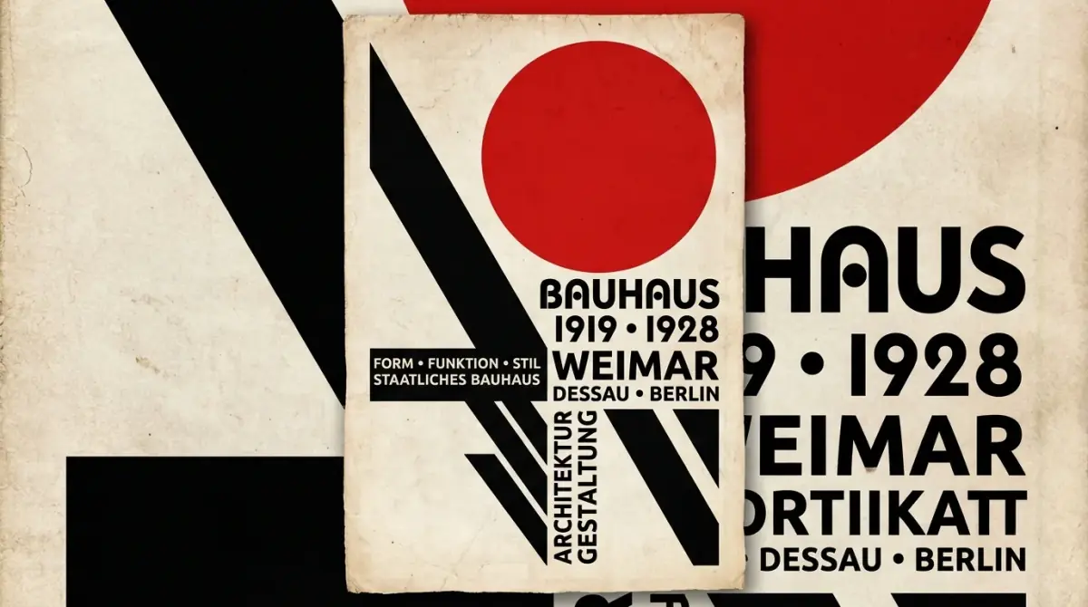
The Bauhaus Typography Revolution — How Geometric Sans Changed Modern Design
When the Staatliches Bauhaus was founded in Weimar, Germany, in 1919 by architect Walter Gropius, Europe was drowning in decorative typography. Books, newspapers, posters, and street signage were dominated by complex, heavy Gothic Blackletter scripts (like Fraktur) or elaborate Victorian serif faces laden with decorative flourishes and ornate drops.
To the avant-garde thinkers of the Bauhaus, these centuries-old typographic conventions were not mere aesthetic choices—they were archaic relics of a feudal past that obstructed clear human communication in a machine-powered world.
What followed over the next fourteen years was the most radical visual revolution in graphic design history. Led by visionaries like Herbert Bayer, László Moholy-Nagy, and Jan Tschichold, the Bauhaus stripped typography down to its pure geometric skeleton: circles, rectangles, and diagonal strokes.
Today, whether you unlock an iPhone set in Apple’s San Francisco, navigate a web interface built on Inter, or admire a minimalist brand identity, you are looking directly at the typographic DNA forged in 1920s Weimar and Dessau.
1. The Core Philosophy: "Form Follows Function"
The fundamental thesis of Bauhaus typography was simple yet revolutionary: type must communicate with absolute clarity and maximum economy, without decorative distraction.
László Moholy-Nagy summarized this ethos in his 1923 essay The New Typography (Die neue Typografie):
"Typography is an instrument of communication. It must be communication in its most intense form. The clarity of the message must be primal; ambiguity must be eradicated."
Before the Bauhaus, page layout was strictly symmetrical. Centered headlines sat above centered body copy, framed by ornamental borders and floral flourishes. The Bauhaus dismantled this symmetry, replacing it with:
- Asymmetric Page Layouts: Organizing information dynamically based on visual tension, whitespace, and logical reading sequence rather than artificial central axes.
- Typographic Contrast: Using stark contrasts in scale, weight (hairline vs. heavy bold), and color (predominantly black, white, and primary red) to guide the reader’s eye.
- The Elimination of Serifs: Viewing serifs as vestigial tails of handwriting that had no place in industrial, mechanized reproduction.
2. Herbert Bayer and the Universal Alphabet (1925)
In 1925, Walter Gropius appointed a 25-year-old Austrian graphic designer named Herbert Bayer as head of the newly established workshop of typography and advertising at the Bauhaus in Dessau.
Bayer was troubled by a fundamental redundancy in the Latin alphabet: why do we need two distinct sets of letterforms (uppercase and lowercase) for every single sound?
Uppercase:  A   B   D   E   G   R
Lowercase:  a   b   d   e   g   r
(Twelve completely different glyph designs to represent six phonetic sounds)
Bayer argued that dual alphabets were an inefficient waste of mental energy, printing metal, and typewriter keys. His radical solution was the Universal Alphabet (Universal Typeface, 1925):
- A Single Case Alphabet: Elimination of all capital letters entirely. Every word—including names, sentence beginnings, and German nouns (which traditionally were always capitalized)—was set in lowercase only.
- Pure Geometric Construction: Every character was mathematically constructed using compasses and rulers, built entirely from circles, arcs, and straight lines.
- No Slanted Strokes: Curves were perfect segments of circles; verticals were strictly 90 degrees.
Bayer’s official Bauhaus letterhead famously proclaimed:
"wir schreiben alles klein, denn wir sparen damit zeit."
(We write everything in lowercase, because we save time this way.)
While the complete abandonment of capital letters proved too radical for mainstream public adoption at the time, the underlying geometric principles of the Universal Alphabet laid the direct groundwork for Paul Renner’s Futura (1927) and later geometric titans like Avant Garde and Century Gothic.
3. Key Milestones: The Evolution of Modernist Type
To understand how the movement evolved from radical school experiments into global graphic standards, examine this historical timeline:
| Year | Milestone Event | Key Figures | Lasting Significance |
|---|---|---|---|
| 1919 | Foundation of the Bauhaus school in Weimar | Walter Gropius, Johannes Itten | Birth of functionalist philosophy: bridging fine art and industrial manufacturing. |
| 1923 | First Major Bauhaus Exhibition & Publication | László Moholy-Nagy | Moholy-Nagy coins "The New Typography," establishing asymmetric balance and visual clarity. |
| 1925 | Relocation to Dessau; Typography Workshop created | Herbert Bayer | Introduction of the Universal Typeface; elimination of capitals; embrace of sans-serif. |
| 1927 | Release of Futura typeface | Paul Renner | Though not a formal faculty member, Renner translates Bauhaus geometric theory into a commercial triumph. |
| 1928 | Publication of Die neue Typografie | Jan Tschichold | Codifies Bauhaus and Constructivist principles into a practical manual for working printers worldwide. |
| 1933 | Forced closure of the Bauhaus under political pressure | Mies van der Rohe, faculty | Faculty emigrate to the US and Europe, transforming a regional German school into a global diaspora. |
| 1957 | Emergence of the International Typographic Style (Swiss Style) | Max Miedinger, Josef Müller-Brockmann | Bauhaus principles evolve into rigorous grid systems and lead to Helvetica and Univers. |
4. Architectural Geometry vs. Humanist Warmth
The genius of Bauhaus typography lies in its uncompromising geometry. However, pure mathematical geometry introduces optical illusions that modern typographers must understand:
Geometric Circle (Pure O):     Appears shorter and thinner than adjacent square letters (H, M).
Optical Circle (Refined O):    Must extend slightly above cap-height (overshoot) to look equal.
When Paul Renner developed Futura in 1927 based on Bauhaus ideals, he quickly discovered that drawing pure mathematical circles and triangles produced letters that felt rigid, mechanical, and uneven in text blocks. Renner introduced subtle optical corrections—varying stroke widths, slight oval adjustments, and custom terminals—to reconcile geometric purity with human eye perception.
This tension between strict geometric rationalism and human optical comfort remains the central debate in modern typeface design.
For contemporary design projects:
- Pure Geometric Sans (Futura, ITC Bauhaus, Circular) communicates boldness, architectural rigor, and avant-garde confidence.
- Humanist Sans (Frutiger, Gill Sans, Open Sans) retains subtle calligraphic stroke modulation for superior readability in long paragraphs.
- Neo-Grotesque (Helvetica, Inter) offers neutral, invisible scaffolding ideal for software user interfaces.
5. How Bauhaus Typography Governs Modern UI Design
If Herbert Bayer or Jan Tschichold were alive today, they would feel instantly at home looking at a modern web or mobile application design system. Every core design pattern in digital product design traces back to Bauhaus doctrine:
1. The Modular Grid System
Before the Bauhaus and the subsequent Swiss Design movement, layouts were improvised. The Bauhaus established mathematical grid systems that divided canvas space into rhythmic columns and rows. Today’s CSS Grid, Flexbox, and 8-point UI grids are direct technological descendants of the Bauhaus layout board.
2. Functional Hierarchy Over Decoration
Notice how modern web headers function:
- Clean, unadorned sans-serif typography.
- Contrast created through weight (Regular vs. Extra Bold) and size rather than different fonts.
- Generous white space acting as an active design element rather than "empty space to fill."
3. Lowercase Branding and Tech Logomarks
The Bauhaus conviction that lowercase text is more approachable, democratic, and efficient sparked a century-long branding trend. From iconic corporate marks (xerox, adidas, bp) to digital giants (facebook, amazon, intel), lowercase geometric letterforms remain the default aesthetic for tech innovation.
The Enduring Legacy of the Bauhaus
The Bauhaus school operated for only fourteen years across three German cities (Weimar, Dessau, Berlin) before being shut down by the Nazi regime in 1933. The authorities condemned the school’s work as "un-German" and degenerate, seeking to forcibly restore Gothic blackletter script as the national standard.
Yet in attempting to crush the movement, the regime inadvertently accelerated its global triumph.
Dispersed across the world, Bauhaus masters brought their functional philosophy to Harvard, the Illinois Institute of Technology, Black Mountain College, and international advertising agencies. Within two decades, the clean, legible, geometric sans-serif aesthetic had become the visual lingua franca of international commerce, modern architecture, and editorial design.
More than a century later, the Bauhaus lesson remains immutable: true beauty in typography does not come from applied ornamentation. It emerges naturally when letters are stripped down to their most purposeful, functional, and honest form.