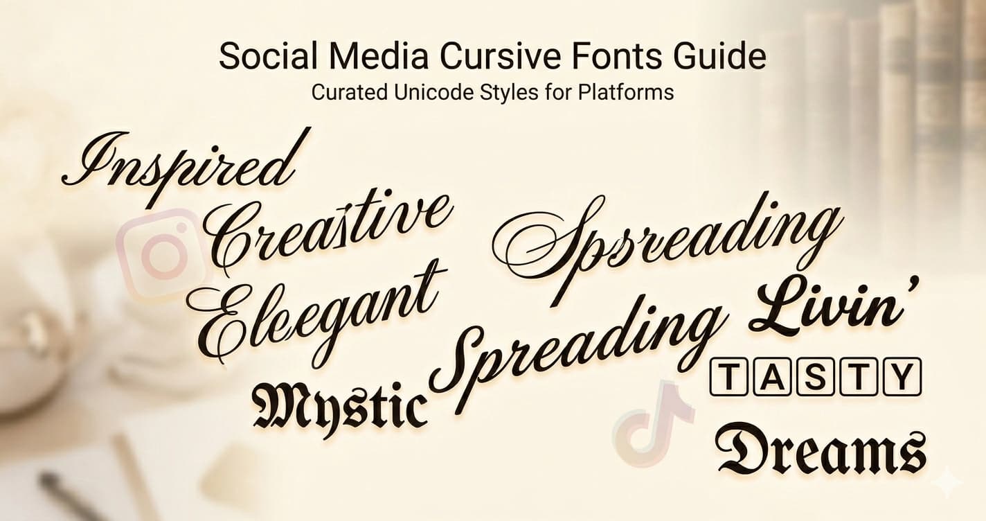
Cursive Fonts for Social Media — Which Style to Use and When
Cursive text is one of the most requested Unicode font styles online — and for good reason. Script letterforms communicate elegance, creativity, and personality in ways that plain text simply can't. Here's a complete guide to using cursive Unicode fonts effectively across social media.
The Two Main Cursive Styles
Unicode includes two distinct script alphabets, each with a different feel:
𝒞𝓊𝓇𝓈𝒾𝓋𝑒 (Regular Script)
The regular script uses the Mathematical Script block (U+1D49C–U+1D4B5 for uppercase, U+1D4B6–U+1D4CF for lowercase). These letters are lighter, more delicate, and feel more traditionally calligraphic — closer to actual handwritten script.
Regular cursive feels: editorial, literary, romantic, vintage
Best for: quotes, poetry accounts, wedding-adjacent aesthetics, literary profiles, anywhere a light and refined touch is needed
Example: 𝒯𝒽𝑒 𝓁𝒾𝑔𝒽𝓉 𝒾𝓈 𝒷𝑒𝒶𝓊𝓉𝒾𝒻𝓊𝓁 𝓉𝑜𝒹𝒶𝓎
𝓑𝓸𝓵𝓭 𝓒𝓾𝓻𝓼𝓲𝓿𝓮
Bold script uses the Mathematical Bold Script block (U+1D4D0–U+1D503). The same flowing forms, but with significantly more visual weight — letters are thicker, more confident, and command attention even at small sizes.
Bold cursive feels: premium, expressive, confident, modern
Best for: personal branding, lifestyle creators, name and tagline emphasis, fashion and beauty profiles
Example: 𝓛𝓲𝓿𝓲𝓷𝓰 𝓶𝔂 𝓫𝓮𝓼𝓽 𝓵𝓲𝓯𝓮
Why Cursive Works So Well on Social Media
Most social media text is sans-serif and uniform — everyone's bio looks essentially the same typographically. Cursive Unicode text breaks this pattern visually. It signals creativity and intentionality without requiring any technical knowledge.
More importantly, cursive Unicode text is genuinely different from regular text in a way that most users haven't seen explained: it's not a font file, it's not a styling trick, it's actual Unicode characters. When you paste 𝓗𝓮𝓵𝓵𝓸 into an Instagram bio, every viewer sees the exact same characters — on iPhone, Android, desktop, any device. There's no rendering difference, no font fallback, no compatibility issue.
This universality is what makes cursive Unicode so practical. It's not a trick that might break — it's a character set as stable and universal as the letter A.
Platform-by-Platform Guide
Both cursive styles work in Instagram bios, captions, and display names. Bold cursive is significantly more popular for a practical reason: it holds up at small sizes.
Instagram renders bio text fairly small on mobile, especially in the profile preview that appears in search results. Regular cursive can get thin and hard to read at these sizes. Bold cursive stays legible — the extra weight compensates for small-screen rendering.
Bio example (bold cursive):
𝓟𝓱𝓸𝓽𝓸𝓰𝓻𝓪𝓹𝓱𝓮𝓻 · 𝓣𝓻𝓪𝓿𝓮𝓵𝓮𝓻 · 𝓓𝓻𝓮𝓪𝓶𝓮𝓻 Capturing light and moments worldwide 📍 Tokyo · Available for projects
Display name example (regular cursive):
𝒜𝓁𝒾𝒸𝑒 𝒦𝑒𝓃𝓃𝑒𝒹𝓎
Regular cursive works beautifully for display names because they appear at a larger size and only need to be rendered once — not in a tiny bio preview.
For captions, both styles work well. Regular cursive suits poetic captions and personal reflections; bold cursive works for attention-grabbing caption openers and key phrases you want to highlight.
Instagram character limit note: Both cursive styles count as 1 character each — no double-counting like vaporwave text. Your full 150 bio characters apply normally.
Twitter / X
Twitter's text rendering is larger and higher-contrast than Instagram's, which makes regular cursive more viable here. On a platform where most content is plain text, even the lighter regular script stands out noticeably.
Bold cursive works particularly well for Twitter display names — it looks immediately distinctive in the profile card that appears when someone hovers over your @handle.
Twitter display name ideas:
𝒜𝓁𝑒𝓍 𝑀𝑜𝓇𝑔𝒶𝓃 𝓢𝓪𝓻𝓪𝓱 𝓒𝓸𝓵𝓵𝓲𝓷𝓼 𝒥𝒶𝓂𝑒𝓈 𝐵𝓁𝒶𝒸𝓀
Bio example:
𝒲𝓇𝒾𝓉𝑒𝓇 & 𝑒𝒹𝒾𝓉𝑜𝓇 Covering culture, tech, and the internet ᴡᴏʀᴅs at @publication
The mix of regular cursive and small caps in that last example shows how different Unicode styles can complement each other when used deliberately.
Twitter character limit: Both cursive styles count as 1 character each. Your bio has 160 characters and your display name has 50.
Discord
Bold cursive is the clear winner for Discord — regular cursive can look too light in Discord's dark-mode UI, which many users keep enabled. The fine strokes of regular script can appear even thinner against dark backgrounds.
Bold cursive display names stand out in member lists and feel distinct from the typical usernames. The flowing letterforms read as personal and expressive — more like a creative identity than a generic username.
Discord allows different nicknames per server, so you can use bold cursive in creative or lifestyle servers while keeping a plain name in professional or work servers. This flexibility makes Unicode styling practical without commitment.
Discord display name examples:
𝓜𝓸𝓸𝓷𝓵𝓲𝓰𝓱𝓽 𝓔𝓽𝓱𝓮𝓻𝓮𝓪𝓵𝓓𝓻𝓮𝓪𝓶 𝓢𝓽𝓪𝓻𝓭𝓾𝓼𝓽
TikTok
Bold cursive in TikTok display names is one of the most common uses of cursive Unicode text. It adds a premium, professional feel that matches beauty, lifestyle, fashion, and wellness content — and it's visible not just on your profile but in comments under every video you post.
TikTok's 80-character bio limit is tight, so bold cursive is strategic here: style just your tagline or niche keywords, keep the rest plain.
TikTok bio example:
𝓒𝓻𝓮𝓪𝓽𝓲𝓷𝓰 𝓼𝓵𝓸𝔀 𝓵𝓲𝓯𝓮 𝓬𝓸𝓷𝓽𝓮𝓷𝓽 🌿 Minimal · Mindful · Modern New videos every week
LinkedIn supports Unicode text in bios and posts — bold cursive and small caps both work in headlines and about sections. This is a less common use but can be effective for creative professionals, photographers, and designers who want to signal creative identity in a professional context.
Use restraint here — a single styled element in a LinkedIn headline reads as intentional; a fully styled profile can look out of place in a professional context.
When to Use Regular vs Bold Cursive
| Regular 𝒞𝓊𝓇𝓼𝒾𝓋𝑒 | Bold 𝓒𝓾𝓻𝓼𝓲𝓿𝓮 | |
|---|---|---|
| Small text / mobile | ⚠️ Can get thin | ✅ Holds up well |
| Elegant, delicate feel | ✅ Perfect | ⚠️ Too heavy |
| Names and headlines | ✅ | ✅ |
| Dark backgrounds (Discord) | ⚠️ Can appear thin | ✅ Better |
| Long passages | ⚠️ Tiring to read | ⚠️ Tiring to read |
| Personal brand | ✅ Softer, literary | ✅ Confident, premium |
| Light aesthetic profiles | ✅ | ✅ |
| Quick-read content (TikTok) | ⚠️ Risk of illegibility | ✅ |
The practical default: if you're uncertain, use bold cursive. It works across more contexts. Only choose regular cursive when you specifically want the lighter, more delicate look — and when you can confirm it renders readably at the sizes your platform uses.
Combining Cursive with Other Styles
Cursive doesn't have to stand alone. Some effective combinations:
Cursive name + plain bio:
𝓜𝓲𝓪 𝓒𝓱𝓮𝓷𝓰 Photographer & director 📍 Los Angeles · 🎞️ Available for editorial
The contrast between styled name and plain bio makes both more effective. The cursive name draws the eye; the plain bio is easy to read.
Cursive tagline + plain details:
𝓒𝓪𝓹𝓽𝓾𝓻𝓲𝓷𝓰 𝓵𝓲𝓰𝓱𝓽 𝓪𝓷𝓭 𝓶𝓸𝓶𝓮𝓷𝓽𝓼 Weddings · Editorial · Commercial 📩 Inquiries: link in bio
Cursive + small caps (different sections):
𝓟𝓱𝓸𝓽𝓸𝓰𝓻𝓪𝓹𝓱𝓮𝓻 ʙᴀꜱᴇᴅ ɪɴ ʙᴇʀʟɪɴ · ᴀᴠᴀɪʟᴀʙʟᴇ ꜰᴏʀ ʙᴏᴏᴋɪɴɢ Portfolio in bio
This combination works because cursive and small caps are visually compatible — both are refined without being garish.
What to avoid: Mixing cursive with gothic, bubble, or vaporwave in the same bio. These styles clash visually and create noise rather than distinction.
Tips for Using Cursive Text
Use it for emphasis, not everything. A bio where every word is in bold cursive loses the effect — the eye has nothing to rest on. Style your name or tagline, keep the rest plain.
Test at mobile size. Regular cursive especially can get hard to read at small sizes. Preview how it looks on your actual phone before finalizing your bio — the desktop preview doesn't always show how it will render for most visitors.
Avoid cursive for contact info. Email addresses, links, and @handles should always be in plain text. Styled Unicode characters in an email address break it — contact@example.com works; 𝓬𝓸𝓷𝓽𝓪𝓬𝓽@example.com does not.
Pair with clean typography. Cursive text pairs well with plain text and small caps. Avoid mixing it with other heavily decorative styles like gothic or bubble in the same bio.
Consider your niche. Cursive reads differently depending on context. A beauty creator using bold cursive signals premium and aesthetic. A tech creator using bold cursive signals quirky and personal. A poet using regular cursive signals literary and intentional. The same font style communicates different things depending on the surrounding content and aesthetic.
What Makes Cursive Unicode Different from Cursive Fonts
When you download and install a cursive font on your computer, that font only renders correctly on your device. Share text in that font to anyone else and they see it in their default font instead.
Unicode cursive is different. The characters themselves are the style — there's nothing to install. When you type 𝓗𝓮𝓵𝓵𝓸 in a social media bio, every viewer sees those exact same characters in that exact same style, regardless of their device, browser, or installed fonts.
This is why Unicode cursive became the dominant approach for social media styling. Cursive font files have been around for decades, but they only work where you control the font rendering. Unicode cursive works everywhere Unicode renders — which is everywhere modern text appears.
Generate Cursive Text
Try both cursive styles at Lettertype — see regular and bold cursive side by side, click to copy, paste anywhere.
Dedicated generators with full alphabets and examples:
- Bold Cursive Generator — the popular, legible choice for most platforms
- Cursive Generator — lighter, more delicate script for editorial and romantic aesthetics
Both generators include per-letter browsing and image download tools for creating custom graphics with individual styled characters.